
Reducing commuter stress
Transit App


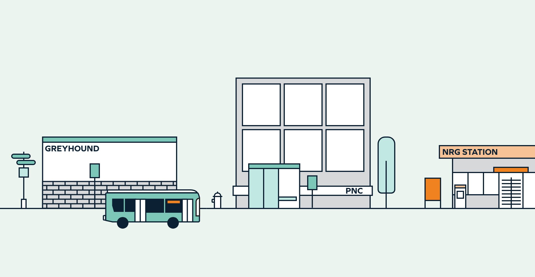
This mobile app helps people track the location of a local commuter shuttle offered by the Philadelphia Navy Yard. The campus resides in South Philadelphia and is siloed from SEPTA transportation.
The app’s usefulness is weighed down by a poor user experience, including menus hiding important information, minimal visual hierarchy and accessibility issues.
Big picture
What wasn’t working
The mobile app had a low findability of key information and a clunky user flow. Additionally, it lacked modern visual design and brand alignment.
What I did
As a study in UX design, I redesigned the app experience and interface while addressing usability issues. I also designed new features to support user needs.
Possible outcomes
If implemented, the updated product would encourage shuttle usage and draw more employees and visitors to the campus.

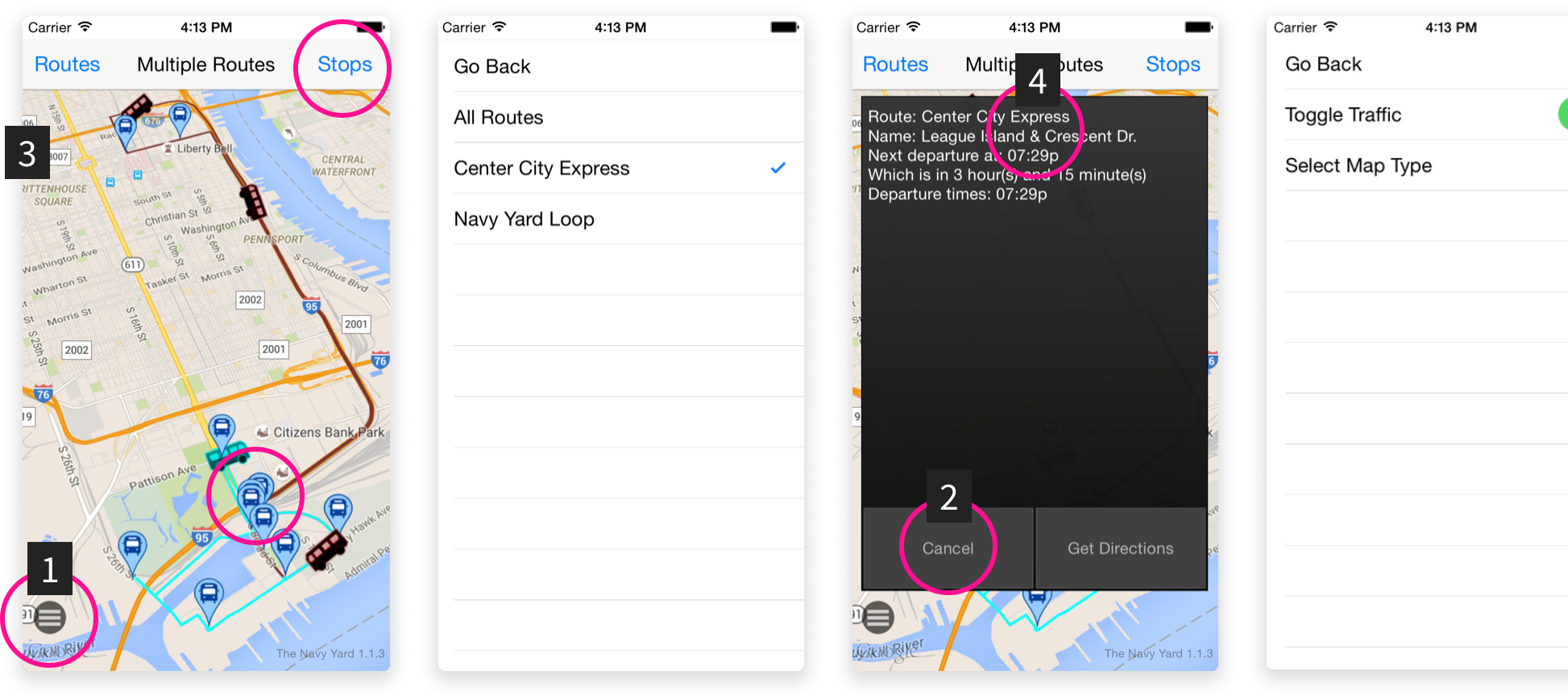
What’s not working
Evaluating the previous app experience with usability heuristics, I identified key issues with the design.
Low visibility of buttons and small touchpoints
Small text with low contrast
No brand representation
Not beginner-friendly
How might we make commuting as stress-free as possible?
Product redesign goals
Provide sense of control
Help commuters feel confident with timely and accurate information
Create single source of information
Reduce the need for multi-channel touchpoints to obtain shuttle information
Provide user autonomy and flexibility
Present users options to change their commute based on circumstances
Represent brand in app
Incorporate existing brand to enhance credibility and present a cohesive experience
What I did
Understanding the current experience
Spoke with shuttle riders about their commuting schedule and app usage
Referenced local travel forums and app reviews
Referenced first-hand observations and personal experience using the shuttle and app
I created a user persona and user journey map to empathize with the various user pain points.
Tracking the app is more valuable and time-sensitive in the morning, when users need to be at work by a certain time
Commuting is frustrating when it’s unpredictable and out of the users control


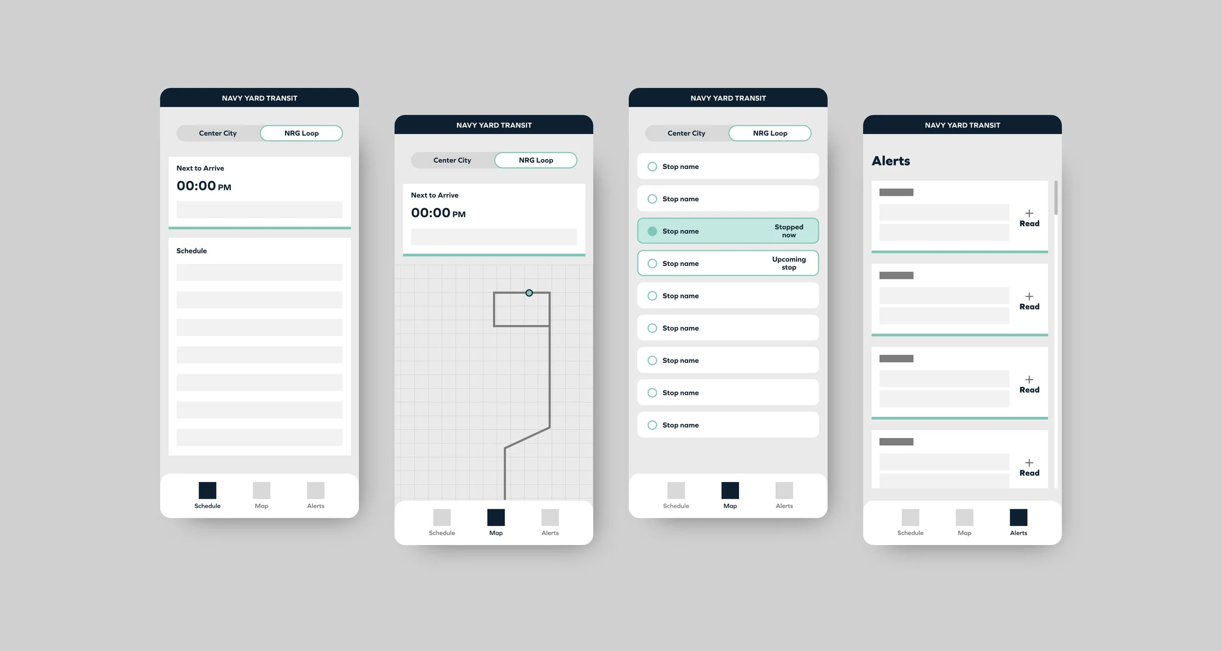
Wireframes and user flows
After identifying the necessary screens, I designed low-fi wireframes to explore the overall structure:
Matching common mobile UI pattern for better layout of information
Strengthening hierarchy to organize key information, such as Next to Arrive highlight at the top
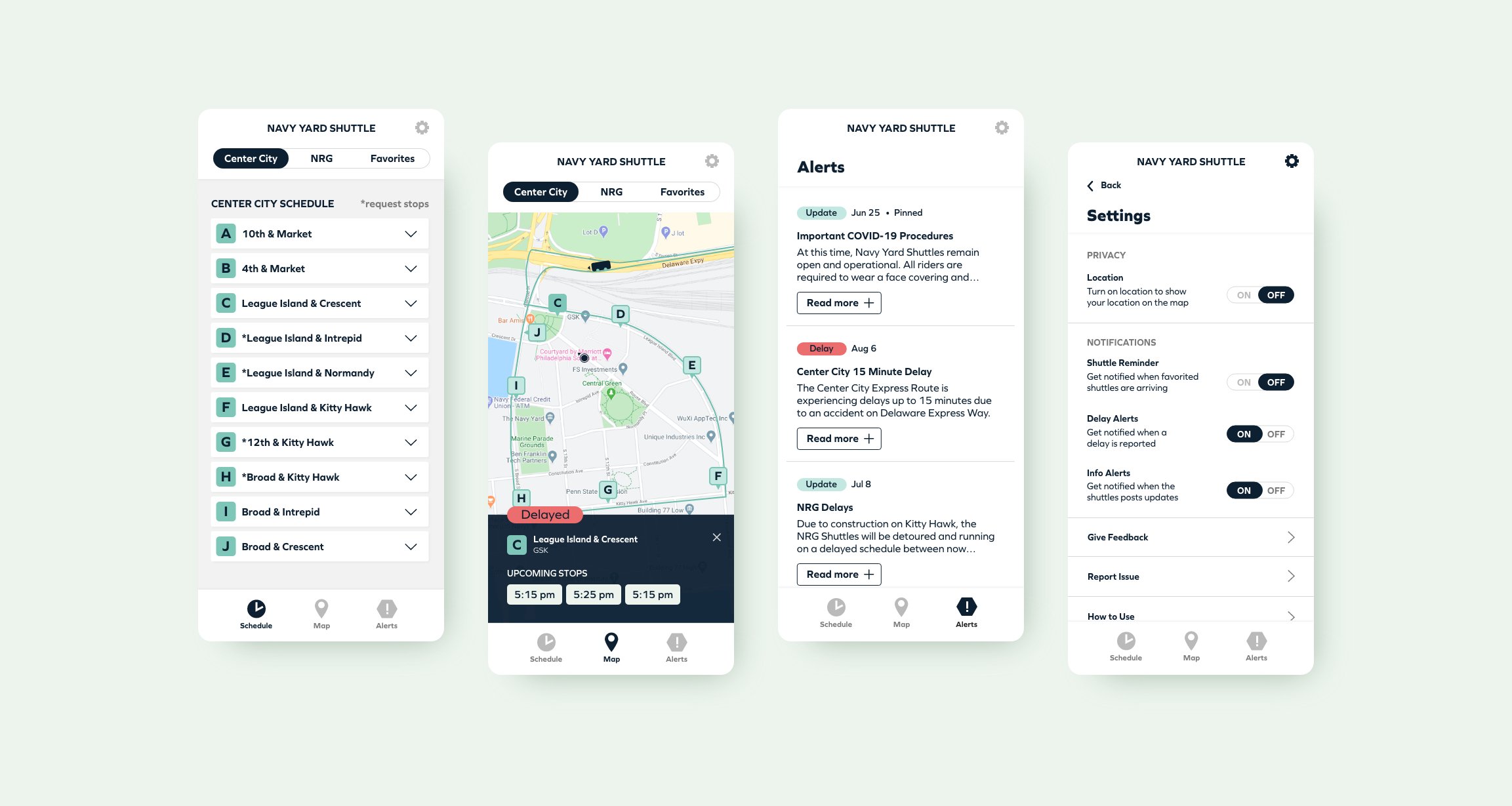
Designing new screens
Before moving onto high-fidelity design, I showed the screens to a first-time user for feedback on first impressions and overall usability.
Solution highlights
Communications within the app
Users can now find schedules and alerts within the app, creating a single source of timely information
Customization for lower interaction cost
Users can favorite stops based on their routine, eliminating irrelevant information and making it faster to access the information they need
Memory cues to lower cognitive load
To make it easier to recognize stops, I reinforced each stop with a letter or number to make it easier to recognize stop names without recalling the intersection
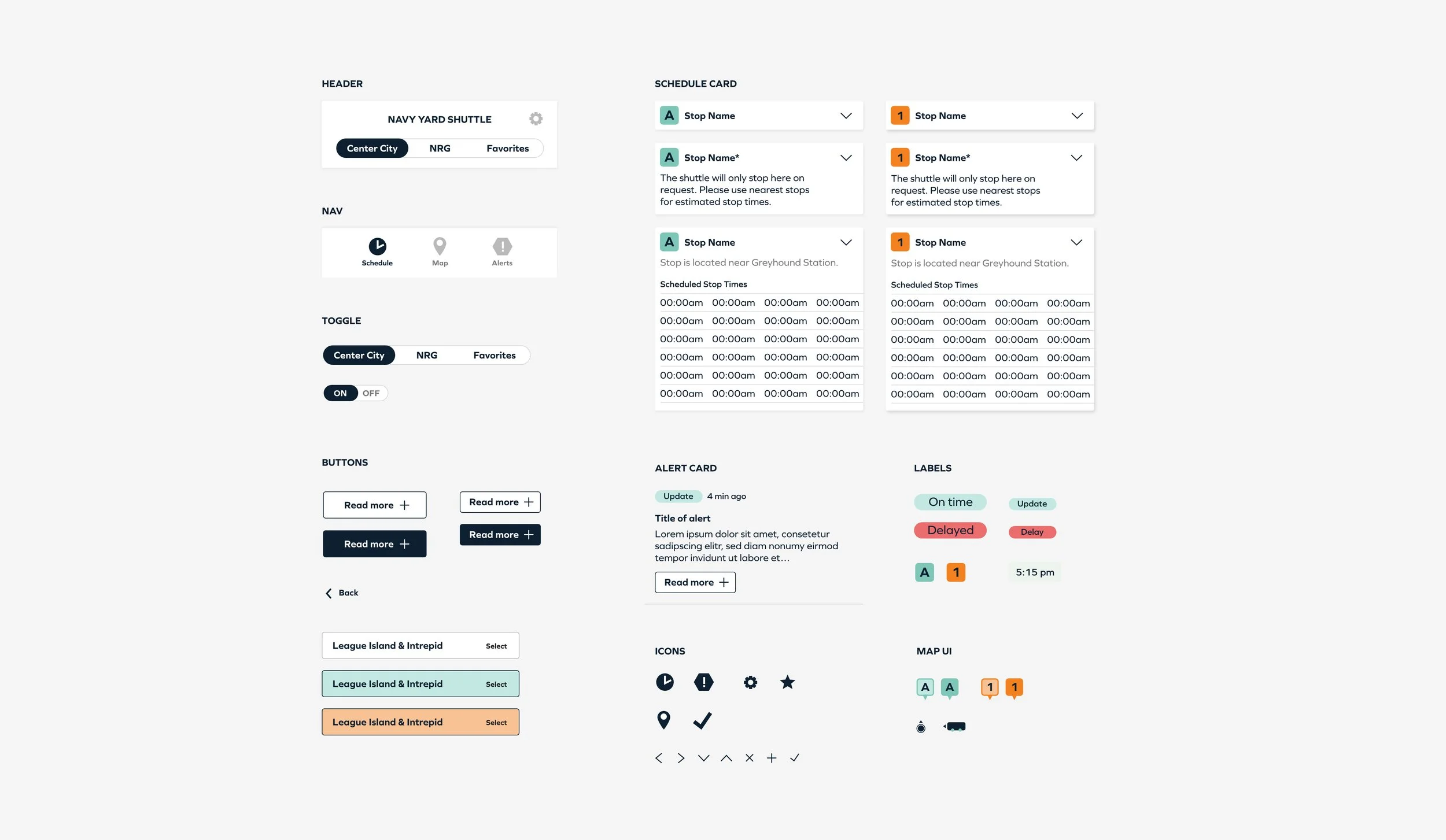
UI design and prototyping
Used Navy Yard's marketing brand to inform the design choices, creating more cohesion across their channels
Created a UI kit to ensure consistent design choices across elements
Used colors to reinforce information and differentiate routes
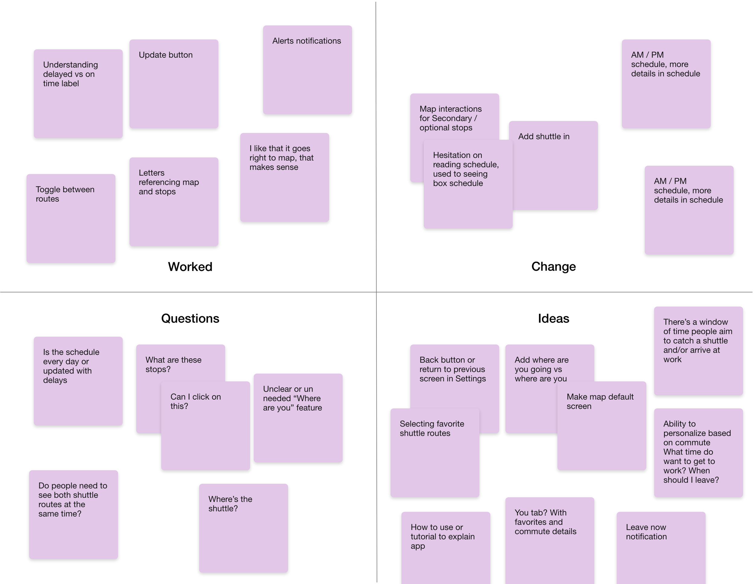
Testing and user feedback
Using a clickable prototype, I showed the app to users for feedback. I asked them to walk me through how they would use the app on their morning and evening commute, sharing feedback as they went. I organized the feedback in a simple feedback grid and used the findings to make tweaks.
Users were somewhat unclear which elements were clickable
Users enjoyed the favorites routes feature